FlexLab Studio Demo
Diese Demo funktioniert am besten auf einem Desktop-Computer mit Chrome oder Edge.
Diese Seite zeigt einige der Visualisierungen aus FlexLab Studio. Wir vergleichen zwei Personen beim einminütigen Ausräumen eines Geschirrspülers. Lan ist 150 cm (4’11”) groß, Tom 190 cm (6’3”).
Wir untersuchen die Unterschiede ihrer Haltung während dieser Aufgabe.
Zunächst können wir ihre Haltung mit der 3D-Visualisierung der FlexTail-Sensordaten vergleichen. Diese Seite ist interaktiv: Verschieben Sie den Regler in den Bildern und drehen Sie das 3D-Modell mit Maus oder Finger. Mit einem Doppeltipp setzen Sie die Ansicht des Modells auf die Ausgangsposition zurück.
Lan
Tom
Der erste Unterschied ist, dass Lan offenbar mit dem unteren Korb begonnen hat. In der ersten Hälfte der Messung beugt sie sich deutlich stärker und in der zweiten Hälfte deutlich weniger. Bei Tom ist es umgekehrt. Darüber hinaus sind aussagekräftige Unterschiede zwischen ihren Haltungen zunächst schwer zu erkennen.
Wichtige Kennzahlen
Viele Bewegungen der Wirbelsäule lassen sich in wenigen Kennzahlen zusammenfassen: Sagittalwinkel, Lateralwinkel, Torsionswinkel und Lendenbeugung.
| Kennzahl | Erklärung | Positive Richtung |
|---|---|---|
| Lendenbeugung | Beugung der Lendenwirbelsäule | Nach vorn |
| Sagittal | Vor- und Rückbeugung | Nach vorn |
| Lateral | Seitliche Beugung | Nach rechts |
| Torsion | Drehbewegung | Nach rechts |
Nun wird deutlicher, dass Lan mit dem unteren Korb und Tom mit dem oberen Korb beginnt. Lan beugt die Lendenwirbelsäule wesentlich stärker und bleibt zudem länger in der gebeugten Position.
Lan
Tom
Mit „Select Series” wählen Sie die angezeigten Reihen aus. Über das Dropdown „Resolution” legen Sie fest, wie stark die Daten geglättet werden.
Spitzen finden
Ein Dichteplot ist eine geglättete Form eines Histogramms. Er zeigt, in welchen Bereichen die Werte eines Datensatzes konzentriert sind. Je höher die Spitze, desto mehr Zeit hat die Person in dieser Position verbracht. Mehrere übereinander angeordnete Dichteplots werden als Ridgeline-Plot bezeichnet.
In diesem Fall stellt die Kurve „Lumbar” die Beugung der Lendenwirbelsäule dar. Werte links bedeuten eine Rückbeugung, Werte rechts eine Vorbeugung. Hier erkennen wir, dass Lan mehr Zeit in extremen Positionen verbringt als Tom.
Lan
Tom
Bei Lans „Lumbar”-Kurve sehen wir einen deutlichen Ausschlag bei etwa -16° und +40°. Das deutet auf eine Rückbeugung hin, vermutlich um in den Schrank zu greifen. Da ihre Reichweite geringer ist als bei Tom, muss sie sich außerdem weiter nach vorn in den Geschirrspüler lehnen.
Tom muss sich dagegen deutlich weniger nach vorn und hinten beugen. Er dreht seinen Oberkörper aber über einen größeren Bereich und neigt sich stärker nach links und rechts. Das zeigt die größere Streuung der „Twist”- und „Lateral”-Kurven.
Mit dem Regler mit zwei Griffen können Sie den im Plot dargestellten Zeitraum einschränken.
Um diese Annahme zu prüfen, betrachten wir die Kombination aus Lendenbeugung und Sagittalwinkel. Der Sagittalwinkel beschreibt im Wesentlichen die Rückneigung (negativ) und Vorneigung (positiv).
Daten filtern
Wir wollen nun sehen, wie der Ridgeline-Plot aussieht, wenn wir nur Zeiträume einbeziehen, in denen der Sagittalwinkel kleiner als 10° ist, die Haltung also mehr oder weniger aufrecht ist.
Lan
Jetzt sehen wir, dass Lan gerade dann am stärksten nach hinten gebeugt ist, wenn sie am aufrechtesten steht. Entdecken Sie weitere Muster, indem Sie die Einstellungen im Widget oben verändern. Die Zeitleiste enthält nun blaue und graue Bereiche. Die blauen Bereiche zeigen, wann die Filterbedingung erfüllt ist.
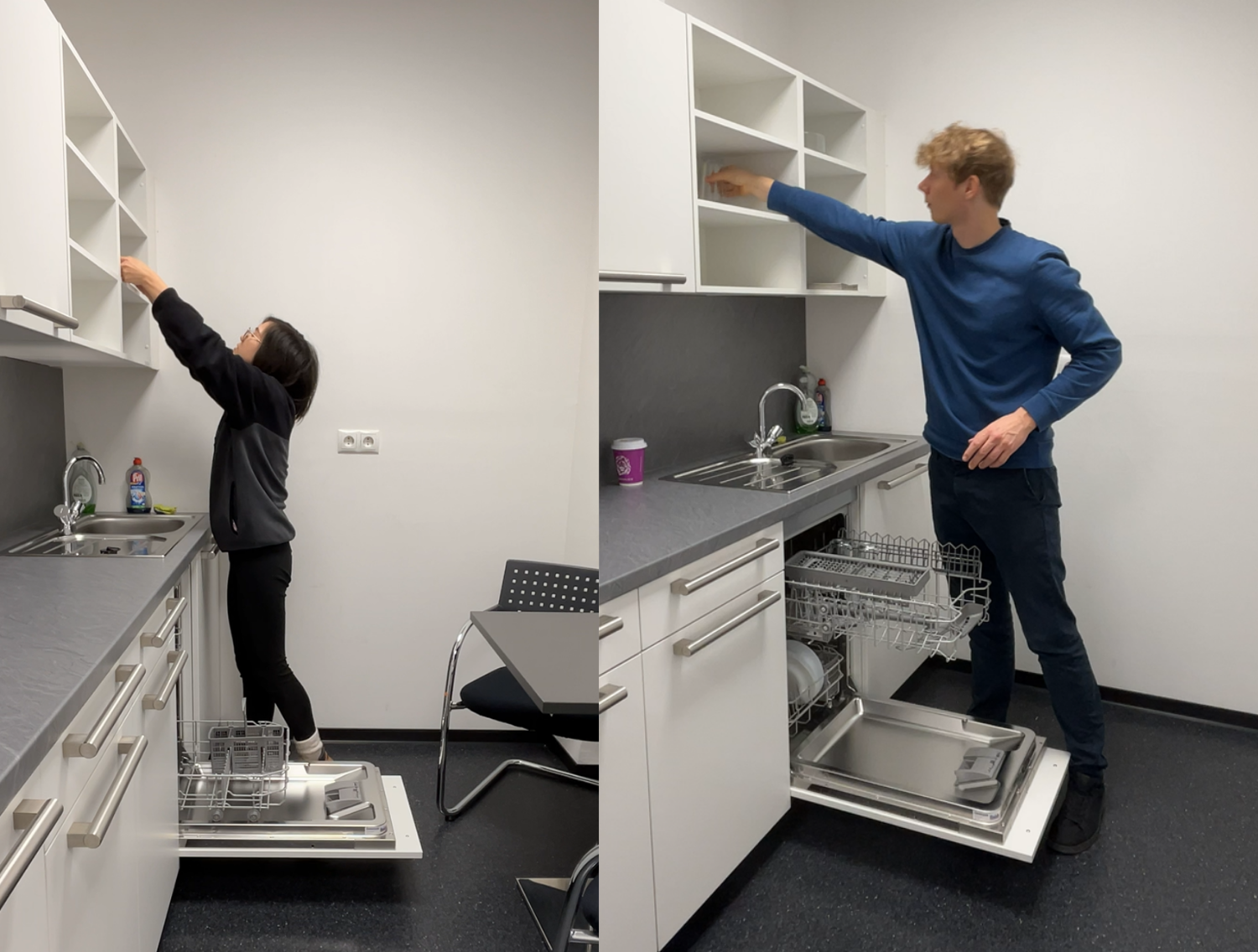
Abgleich mit der Realität
Vergleichen wir ein Bild der beiden, sehen wir, dass Lan sich tatsächlich weiter strecken muss, um in den Schrank zu greifen. Auch wird klar, warum Tom während der Messung mehr Torsion zeigt: Er dreht den Oberkörper, während die Füße stehen bleiben. Lan dreht ihren Körper dagegen über die Füße.
Weiterführende Analyse
Diese interaktive Demo zeigt, wie leistungsfähig unsere Visualisierungstools für die Analyse menschlicher Bewegungsdaten sind. Die hier entdeckten Muster sind nur ein Anfang dessen, was mit einer fundierten Datenanalyse möglich ist.
Möchten Sie tiefer in die Datenanalyse einsteigen? Unser Jupyter-Notebook zeigt, wie sich diese Sensordaten mit Python, pandas und Visualisierungsbibliotheken programmatisch verarbeiten lassen.